Creating a book full of memories that students make throughout the year is not as easy as it
sounds. One may believe that pasting a bunch of images on some pages is all it takes, but it is
much more than that. Everything about the yearbooks we make are from the ideas of our
Yearbook Staff. From the theme of the book, to the page layouts, and the writing pieces are all
student-produced. As I have been a part of the yearbook-producing process since the seventh
grade, I am quite accustomed to how the production works. I started designing page layouts,
also known as spreads, since my sophomore year. One may think that it is an easy job, but it
becomes very challenging when you have to design the whole book of at least 300 pages. Each
spread is designed with thought about what will go on those pages, how much content we have
for it as a staff, and its correlation to the theme. While it took me awhile to adjust my brain to
design spreads based on this criteria, anyone can design spreads with the steps given to them.
In order to design a yearbook spread, you will need a program, or software, that provides all
sorts of tools, image placeholders, shapes, and texts, as well as an imagination.
1. Understand what type of spread you are designing before beginning. Types of spreads
vary from dividers, sports, activities, clubs, and more. In this tutorial, I am going to design
a sports spread. Sports spreads typically have more pictorial content, rather than a
statistic or infographic about that sport’s season. This means that the spread should be
filled with lots of pictures and lots of room for writing about that sports game, match,
race, etc.
2. Begin designing the spread with the dominant photo. The dominant photo is the largest
picture on that spread with a purpose of catching the viewer’s attention. Place a large
photo anywhere on the spread, while simultaneously leaving space for other pictures
and captions.
When learning how to design, it was a challenge to find out specific sizes for the
dominant photo that did and didn’t work. Designing takes a lot of time and experimenting with
different shapes and forms, which is what I learned to like about it. I used to dread making every
single layout vary from each other, while also making it look clean. Now, I understand that the
time it takes to make a spread is crucial to producing one that is visually appealing.
3. Next, place images of smaller sizes next to the dominant to create what I call a
“Dominant Package.” Dominant packages consist of a dominant photo next to a smaller
set of photos to be the main highlight of the spread. For example, if a sport won CIF,
those pictures would be in the dominant package. These photos tell the story of what
best happened during that season.
4. Then, create your first module, starting with placing more imageholders. Modules are
groups of photos that are correlated to each other to provide another view of the sport on
the spread. For example, if the main highlight of a sport was that they won CIF, a module
would be the team players practicing. The Yearbook Staff’s purpose is to cover as much
content as we can to create pages full of memories throughout the year. By designing
space for modules, it allows the staff members to write more about the sport.
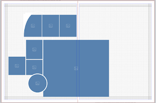
5. Create your second module with the space that you have left. Be sure to leave some
room for the text boxes, so that the spread is not just pictures. Modules can vary in all
types of forms, it is up to your imagination to lay out what you envision your spread to
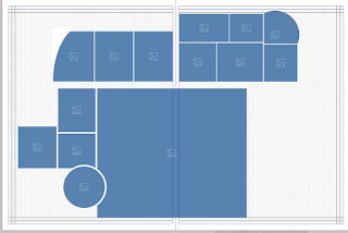
look like. The left module has three photos and the right module has six photos. In my
opinion, spreads with more photos are better-looking to the eye.
If you haven’t noticed yet, I have three curvy-shaped image placeholders. This year’s yearbook
theme relates to have three circular design elements throughout the book. I incorporated these
design elements through the shape of photos. This portrays the importance of having a stable
and understandable theme to be able to fit the layouts of every single spread in the book.
Though the yearbook is supposed to be a surprise as a whole, here’s a sneak peak to what a
general sports spread looks like. Keep it a secret!
6. Finally, add some text onto the page, beginning with the “Story Package.” The story
package consists of a headline, a sub-headline, and the story for that spread. Stories on
sports spreads typically are written about the main highlights of that sport for that specific
season. Thought the pictures showcase the highlights of the sport, the story’s purpose is
to give more in-depth information, for history purposes.
7. Continue to add more text to the spread so that the viewers know more context about
the photo. Each photo needs captions to tell the complete story. There are two types of
captions, regular captions and story captions. Regular captions are the plain captions
that describe a photo each. Story captions describe a module of photos as whole.
Modules that have story captions include tag lines on each photo that name each
student. Both types of captions are used throughout spreads in the yearbook.
Every module should have a headline, just like how every story needs a headline.
Module headlines are used to differentiate the type of content from the rest of the page.
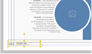
8. Lastly, do not forget to place your folio and your by-lines on both bottom corners of the
spread. Folios are the page numbers and by-lines credit those who designed the spread
and who inputs content on the spread.
Now you know how yearbook spreads are designed. It takes practice to create a decent-looking
layout, but becomes easy once you master it. I enjoy making layouts because I am a visual
learner. I love all things organized, laid out, and clean, which is why designing yearbook spreads
has led to a passion in making layouts for everything. I have lots of fun with drawing and
organizing various types of layouts, which I thank being a part of the Yearbook Staff for.


Hi Jill,
ReplyDeleteI thought this "how to" was very interesting and clearly detailed! I never knew that editing the yearbook took this much time and effort! The way you explained the layout of the module and how there are many varieties was very organized. You have a great talent and EHS is lucky to have had you as part of the yearbook staff this year :)
-Francine Lazo